
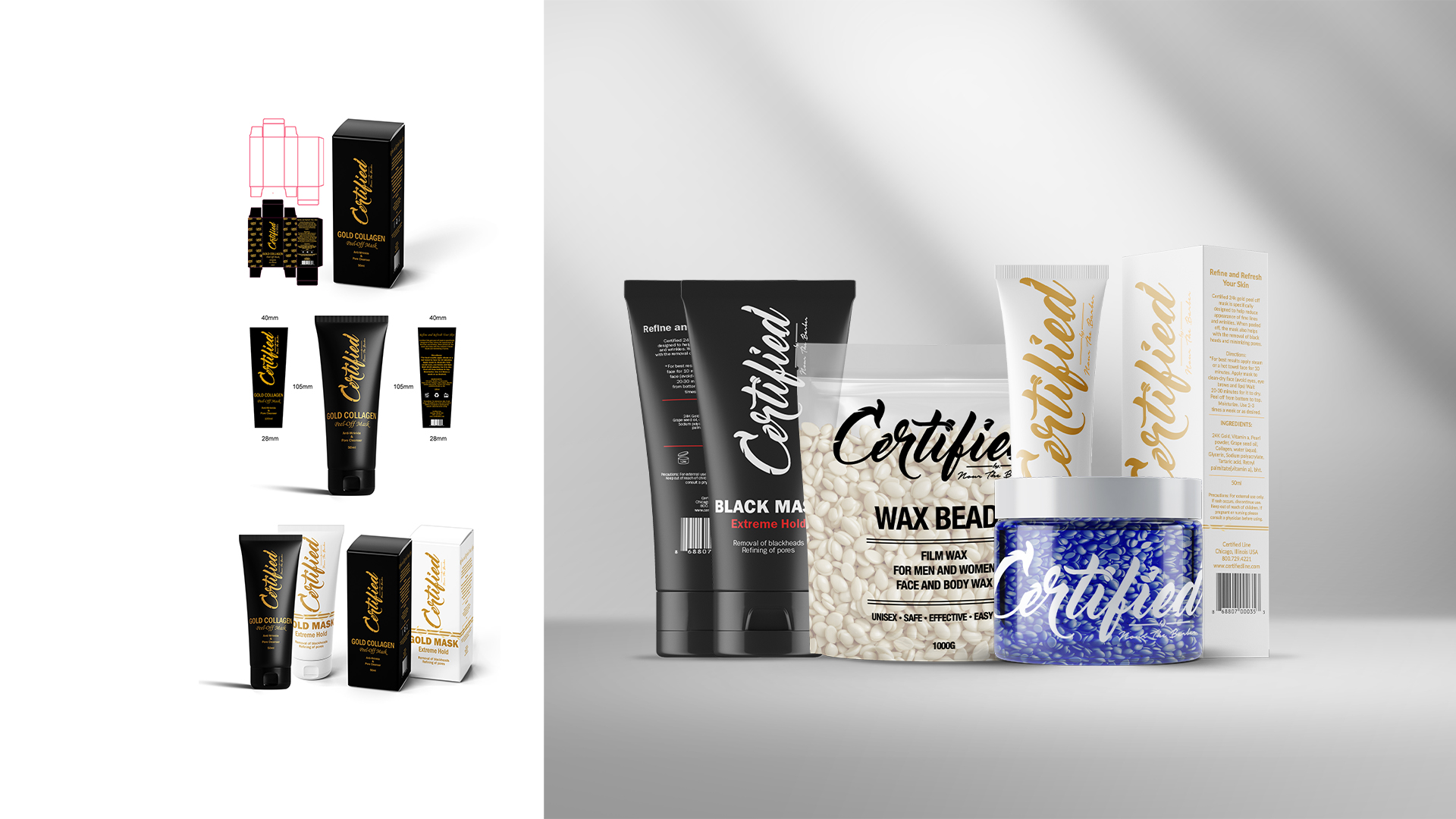
Certified needed to overhaul its cosmetic product line (facial wax, shaving gel, hair pomade) to align with an upscale market. Existing designs didn’t convey a premium feel.
Audited competitor packaging, then defined a “less is more” direction. Redesigned 10+ SKUs with clean typography, simplified hierarchy, and premium finishes. Coordinated with vendors to ensure dielines, inks, and materials translated flawlessly into production.
A refined cosmetic line with elevated shelf presence that positioned Certified as a credible competitor in the premium grooming category.
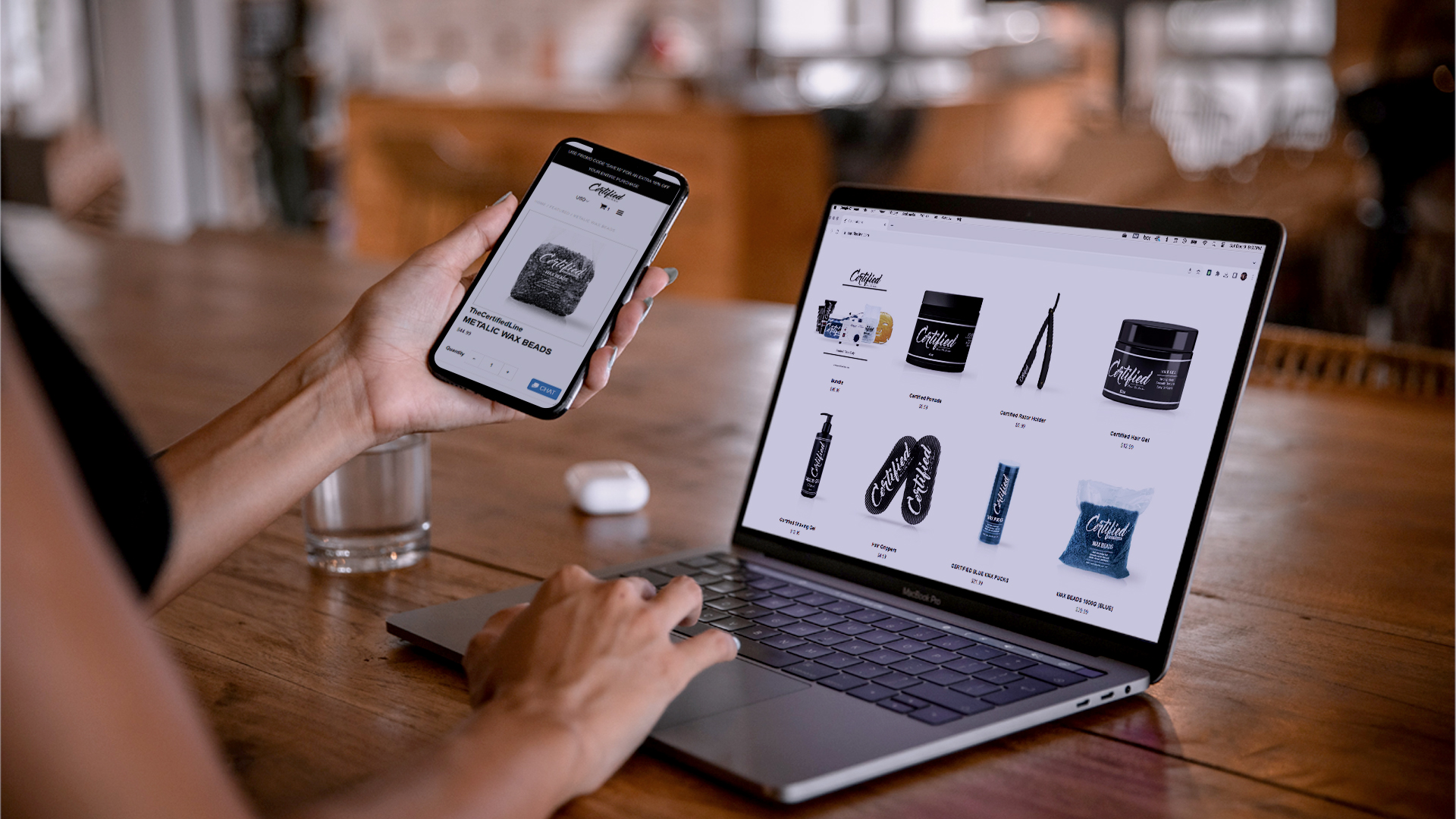
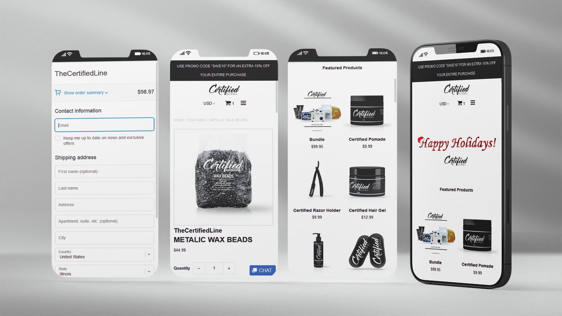
The Shopify store had confusing navigation and friction in checkout, leading to cart abandonment and support complaints.
Mapped user journeys, simplified IA and menu labels, improved collection filters, and streamlined PDPs (benefits-first copy, clear variant states, visible shipping/return info). Tuned theme performance (image sizing, lazy loading), tightened ADA contrast and focus states, and reduced checkout steps with trusted badges and clear progress cues.
A cleaner, faster path to purchase with reduced friction from discovery to checkout, better mobile usability, and a storefront that matched the brand’s premium positioning.
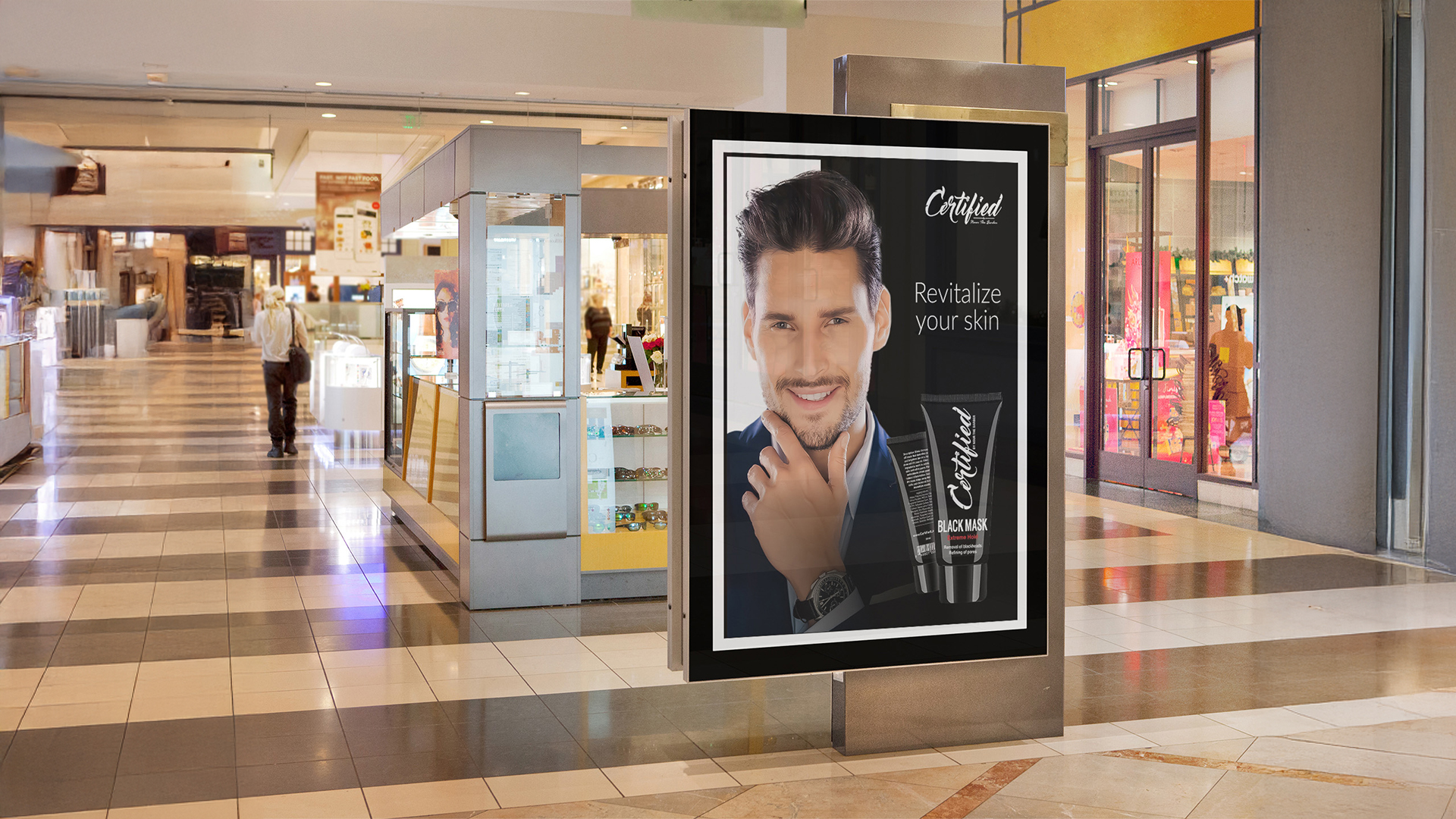
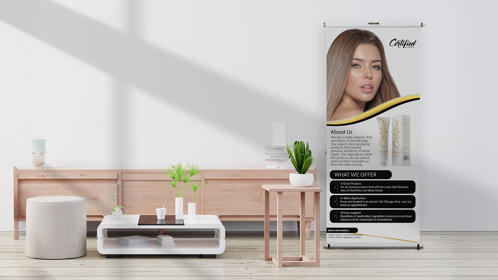
Elevate brand presence in retail and public spaces with premium, on-brand visuals.
Designed large-format posters, banners, and in-store displays to mirror the product line’s upscale aesthetic. Added office flyers to unify internal messaging.
A cohesive advertising suite that helped Certified appear established and premium in competitive retail environments.
This work sharpened my cross-channel refresh skills—from packaging and Shopify UX to retail advertising. I learned how to pair a premium aesthetic with practical constraints (production specs, performance, accessibility), and how to collaborate with vendors and stakeholders to keep execution consistent across physical and digital touchpoints.